Saturday 7 May 2011

Postmodernism in Graphics


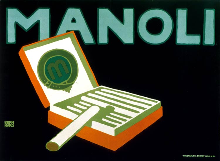
Postmodernism is a movement that started as rejection to the international or the modernist style. Though post means after in this case it means opposed of modern. If modernism meant realty, rationality and perfection, postmodernism was fiction, denial of presence, and mistakes (Hoffmann, 2005,36). They believed that everything we know and even us are results of an error (from modernism to postmodernism an anthology, 2003, 10). That why they deliberately made mistakes in their designs.


Who started postmodernism was the generation that was raised by TV, because it opened their mind to the world and to a different way of thinking (Albright, 1985, 169). They adopted historical styles that was rejected by modernist and presented them in a new sprit (Albright, 1985, 169, Eskilson, 2007, 338). They also sometimes used many styles in one design that may not be consistent, combined them together, then presented them in unusual way. 


From its beginning until now postmodernism had passed through stages until it reached its maturity. During the 60s until the mid of 70s a style had presented postmodern among youth and pop fans in the US and the UK. It is called the psychedelic art after a drug that was used by youth at that time. It was clear in their posters that they were influenced by art nouveau and the dada more than any other style (Eskilson, 2007, 338). They loved fiction and dreamy-like illustrations that gives the feeling of being on drugs (Albright, 1985, 169).


(fig.1) by Victor Moscoso


This poster is a good example for the psychedelic style. Like any other psychedelic posters it is characterized with its vivid, bright colors and contrast between those colors, and unrealistic illustrations.

Another type of postmodernism is the postmodernism of resistance or postmodernism of reaction (Sinfield, 1989, 294). This type of design was mainly targeting social and political issues. Designers wanted to draw attention to crimes that were made by society (Sinfield, 1989, 294).


During the 1980s postmodern had reached its maturity mostly because of the appearance of computers (Albright, 1985, 169). Designers could easily experiment with their designs and develop new typefaces that competed with Helvetica, the international style favorite typeface. Designers like Weingart and Brody were the ones who made postmodernism well known (Eskilson, 2007, 352). Those designers had put rolls and academic experiments to postmodernism that transformed it to a new stage. It became, unlike the Dada, a controlled disorder, and the mistakes they made were deliberated ones (Eskilson, 2007, 353). Even with those rolls postmodernist were open to each personal style (Eskilson, 2007, 353).


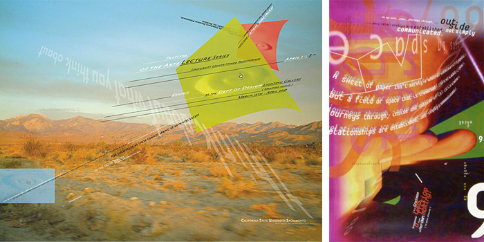
(fig.1) by April Greiman

This poster shows how much postmodernism has developed since the 60s. Greiman has fallowed the movement’s character by using different typefaces and paste them to overlap randomly with the background.


References


Albright, T. (1985). Art in San Francisco Bay Area 1945-1980: An Illustrated History. USA: University of California Press.

Eskilson, S. (2007). Graphic Design: A New History. USA: Yale University Press.

From Modernism to Postmodernism: an Anthology. (2003). Lawrence Cahoone. Blackwell Publishing.

Hoffmann, G. (2005). From Modernism to Postmodernism, Concepts and strategies of Postmodernism American Fiction. Theo D’hean, Hans Bertens. USA, New York: Editions Rodopi.

Sinfield, A. (1989). Literature, politics, and culture in postwar Britain. USA: University of California Press.


Saturday 12 March 2011

Sachplakat


Sachplakat or object posters are type of advertising posters that is known by its simplified illustrations of a single object and bold headline (Heller,2010,p.123). It was created by a designer named Lucian Bernhard in 1903 in Germany. Bernhard got the idea when he entered a poster competition for the Priester match company, and he made a typical art nouveau poster. The poster showed a cigar in an ashtray beside them two wooden matches all on a tablecloth and from the cigar smoke comes out in dramatic way that formed a beautiful dancing woman. When he showed his posters to people they mistook it for cigar company’s advertising. So he removed all the elements that were distractions, and kept only the two matches on completely flat background then he wrote the company name on the top with bold letters.

(fig.1)


The poster was too revolutionary that it was rejected at once. People at that time were used to visual complexity, so the simple two matches weren’t expiable (Swanson, 2000). Especially that they were painted only in bright yellow and red. But Ernst Growls, who was overseeing the completion, loved the poster and saw in it what others couldn’t (Raimes, 2007, p.34). He saw the uniqueness of the relationship between the bold type, the object, and the background (Raimes, 2007, p.34). The poster was printed and released on streets where it made an impact. 
  
(fig.2)


(fig.3)

Bernhard established himself as a professional graphic designer after his successes, and other clients started to come to him.


Many historians think that Bernhard got the influenced from the English Beggarstuff Brothers. But why his object posters get huge successes?

During the 19th and the 20th century life started to change and big cities appeared. Life at that time has begun to be faster and people had no time for complexity (Swanson,2000). So Bernhard direct massage was what was needed in advertising. Another thing is that Bernhard had displayed unique colors collections of bright strong colors (Aynsley,2000,p.78). And what helped him more that new strong inks were developed at that time that he used (Aynsley, 2000, p.78). Also Bernhard had always developed his own type designs according to what his works’ needs (Aynsley, 2000, p.79). More importantly the simplicity of his subjects had made the posters clearer and stronger (Aynsley, 2000, p.79). Though at that time people weren’t aware of marketing methods and what attract consumers, Bernhard had put his hands on advertising secrets.

Julius Klinger

After Bernhard successes many designer and advertising firms had started producing sachplakat too. Like Julius Klinger who designed poster for Mohring chandelier factory, 1909. 


(fig.4)


This poster though it has the same technique, Klinger had made it simpler than Bernhard’s posters. He kept only the basic shape of the chandelier and painted it in bright yellow color that made strong contrast with the black background. Even the colors were completely flat with no shading at all. To give the light effect he painted the lambs in white and surrounded it with small yellow dots that made it look as if it was shining.


Hans Rudi Erdt


(fig.5)


(fig.6)

This poster was made by a great sachplakat designer Hans Rudi Erdt for Opel cars. What is unusual in this poster is that Erdt didn’t display the object it self as it was known in the sachplakat style, instead he presented the product by whose using it which was a man with driving goggles perched on his head (Eskilson, 2007, p.112). Then when he wrote the product name he made the O look like car’s wheal (Eskilson, 2007, p.112). Which was technique that was used by the Beggarstaff Brothers (Eskilson, 2007, p.112). 


Ludwig Hohlwein


Another famous sachplakat designer is Ludwig Hohlwein (1874-1949). Hohlwein was trained to be an architect but he changed it and become a designer. But unlike Bernhard and klinger, Hohlwein didn’t embrace modernism completely; instead he had strange yet unique mixer of modernism, abstraction, sachplakat style, and even cubism in his posters (Gerber,2010,p.14). His posters usually have strong figurative elements of high class women that are mostly made of combination between abstraction and 3D style (Eskilson, 2007, p.112) (Gerber, 2010, p.15).
After 1917 the first war world had started and governments controlled art and design to serve their purposes (Aynsley, 2000, p.80). And because of that controlling artists and designers didn’t have the freedom to produce what they wanted and many of them have become tools for the war, and sachplakat was changed to serve it (Aynsley, 2000, p.80). Bernhard was one of the designers who had made posters about the war until he traveled to the US to become one of the famous European designers there (Aynsley, 2000, p.80).


Otto Baumberger


After war world two sachplakat became popular in Swiss where other famous sachplakat designers had appeared. Otto Baumberger (1889-1961) was one of the first designers who can be described as poster designers and was ahead of his time. He could clearly see what consumers wants and that why he used sachplakat style in his posters. But he also made his new Swiss version of sachplakat. 


(fig.7)

(fig.8)


(fig.9)

(fig.10)

He also combined photography in his posters to make it more special.


References
Aynsley, J. (2000). Graphic Design in Germany: 1890-1945. USA: University of California.


Bhaskaran,L. Raimes,J. Renow-Clarke,B. (2007). Retro Graphics: A Visual Sourcebook To 100 Years Of Graphic Design. Chronicle Books
Eskilson, S. (2007). Graphic Design: A New History. USA: Yale University Press.
Gerber, A. (2010). Graphic Design The 50 most influential graphic designers in the world. Britain: A & C Black Publishers Ltd
Heller,S. (2010). Pop: How Graphic Design Shapes Popular Culture. Allworth Communications, Inc.

Pamela,E. (et. al). (2007). Selling Modernity: Advertising In Twentieth-Century Germany. Duke University Press.